Basic Styling
You can apply styling props directly to the components via style prop, which takes a GSStyle object. There are various props available in GSStyle object that control almost all aspect of styling that Gluestack ui Flutter provides!
Let's say we want a green colored button and we have defined a custom color token for green400 which we would like to use. The implementation for that would look like the following.

GSButton(style: GSStyle(bg: $GSColors.green400),onPressed: () {},child: const Row(children: [GSButtonText(text: "Add"),GSButtonIcon(icon: Icons.add)],),),
There are lot of other props as well to chose from.
Complex Styling
You can also handle more intricate styling, such as styles for different screen sizes, platform, system theme - light and dark and descendants. Certain style props take GSStyle object itself as a param, this unlocks whole new world of complex nested styling that was impossible in Flutter before.
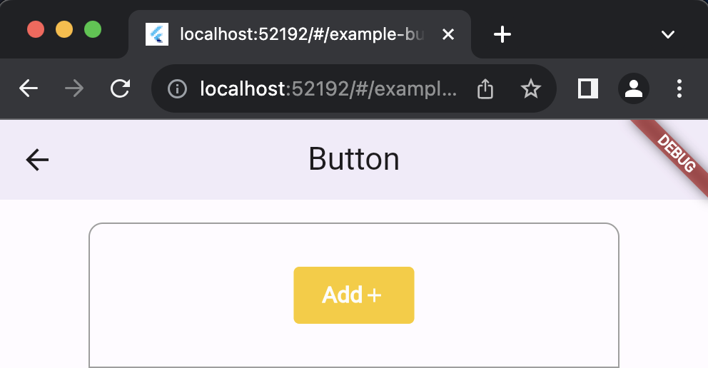
Let's say you wish for your button component to appear yellow when the app is running on web, you can do that as follows

GSButton(style: GSStyle(bg: $GSColors.green400,web: GSStyle(bg: $GSColors.yellow400),android: GSStyle(bg: $GSColors.red400),//....other platforms),onPressed: () {},child: const Row(children: [GSButtonText(text: "Add"),GSButtonIcon(icon: Icons.add)],),),
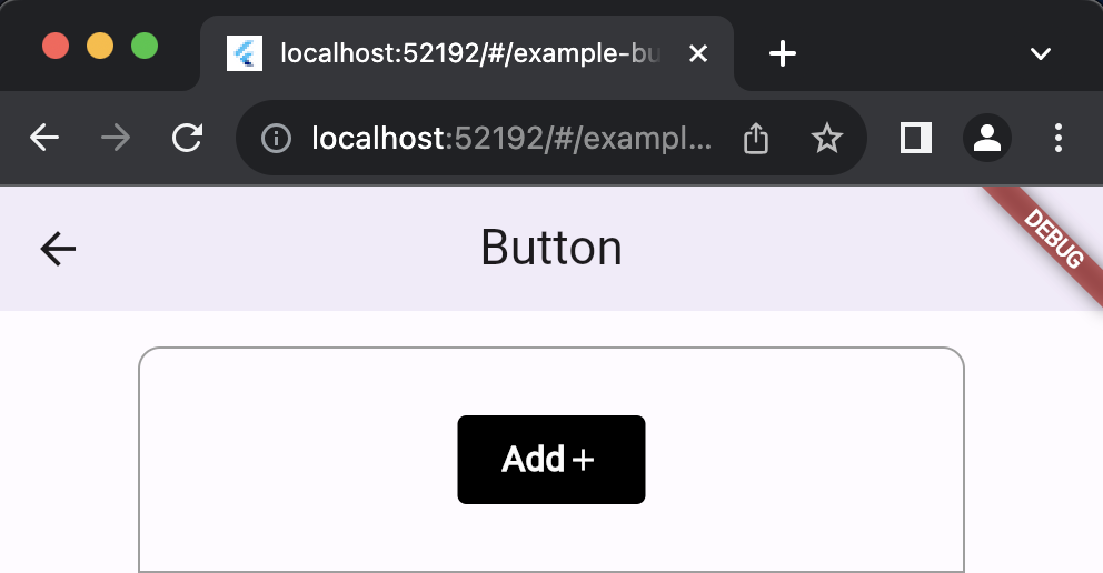
Similarly, if we wish for your component to appear black on small screen when sm breakpoint is reached in the code above, we can do that too like so.

GSButton(style: GSStyle(bg: $GSColors.green400,web: GSStyle(bg: $GSColors.yellow400),sm: GSStyle(bg: $GSColors.black),),onPressed: () {},child: const Row(children: [GSButtonText(text: "Add"),GSButtonIcon(icon: Icons.add)],),),
Note: Incase of duplicate definition of props, example - if dark mode style is defined inside the parent GSStyle but is also declared inside a screen breakpoint, md, the dark prop inside parent GSStyle will be applied as it would have more order of precedence that the rest of dark prop that is applied.
Edit this page on GitHub