Responsiveness
The components present in @gluestack-ui-flutter are responsive and their styling can be changed according to device's screen. The screen breakpoints used in @gluestack-ui-flutter can be found here, or, you can also refer the following:
sm: (min-width: 480px)md: (min-width: 768px)lg: (min-width: 992px)xl: (min-width: 1280px)
We can apply different styling based on different breakpoints, if we wish for your component to appear black on small screen when sm breakpoint is reached, we can do that too like so.
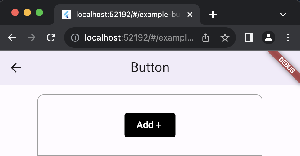
GSButton(style: GSStyle(bg: $GSColors.green400,sm: GSStyle(bg: $GSColors.black),),onPressed: () {},child: const Row(children: [GSButtonText(text: "Add"),GSButtonIcon(icon: Icons.add)],),),
Responsive Layouts
In real world applications, often time there is a need to control entire layouts or parts of layouts to be responsive, that's why we have created multiple widgets that makes this process easier.
Let's take an example of GSFlex which can arrange widget content inside to be displayed horizontally or vertically depending on screen size.
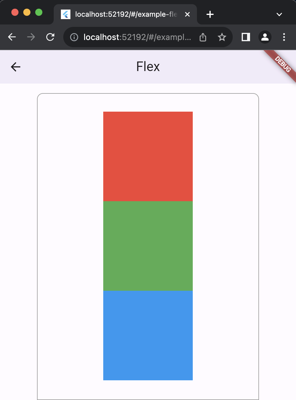
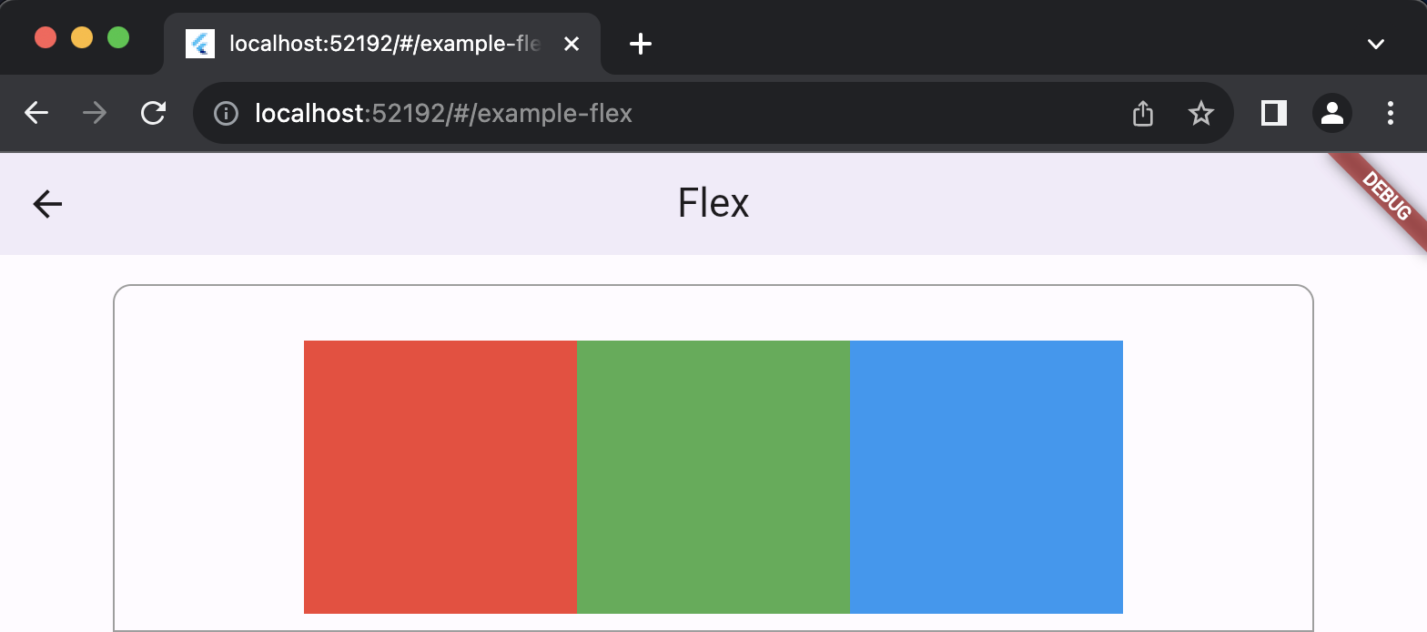
GSFlex(mainAxisAlignment: MainAxisAlignment.center,crossAxisAlignment: CrossAxisAlignment.center,style: GSStyle(direction: Axis.vertical,md: GSStyle(direction: Axis.horizontal),),children: [GSBox(style: GSStyle(height: 150,width: 150,bg: Colors.red,),),GSBox(style: GSStyle(height: 150,width: 150,bg: Colors.green,),),GSBox(style: GSStyle(height: 150,width: 150,bg: Colors.blue,),),],),
Edit this page on GitHub