Introduction
gluestack-ui-flutter is a universal UI library that provides optionally styled and accessible widgets. These widgets are designed for easy integration into applications developed with Flutter. gluestack-ui-flutter could offer Flutter widgets designed for a consistent look and feel across mobile and web platforms, adapting to specific platform interactions and layouts where necessary.
Developers can choose pre-built themes (using Flutter's styling capabilities) or apply custom styles via Dart code or external CSS files, catering to specific branding and web aesthetics.
Why we built gluestack-ui-flutter?
The gluestack-ui-flutter is designed to enhance web and mobile app development. It features platform-agnostic components for consistent UI across platforms, offers styling flexibility with pre-built themes and custom options, and emphasizes accessibility. Tailored for web development, it includes web-friendly widgets, native web styling, responsive design, and smooth animations. Key considerations are Flutter web specificity, performance optimization, and community engagement. The library also enables centralized styling, consistency, reusability, scalability, efficient development, and rapid prototyping, aiming to foster collaboration and ensure a unique, high-performance UI experience.
Features
- Customizable widgets: Each widget in the library comes with a set of customizable props that allow you to tailor its appearance and behavior to your specific needs.
- Declarative and Dynamic Styling: By using JSON for style configurations, you're enabling a more declarative approach to UI design. This can be particularly powerful when styles need to be changed dynamically or loaded from external sources.
- Web-focus: While Material and Cupertino excel on mobile, gluestack-ui-flutter could be tailored for web experiences, offering components and styles optimized for desktop interaction and layout. Think responsive design, mouse hover interactions, and web-specific UI patterns.
- Flexibility for Developers: Providing inline style overrides gives developers the flexibility to quickly customize components on a case-by-case basis, without the need to alter the JSON configuration for minor tweaks.
- Responsive design: The widgets are built using modern web design principles and are fully responsive, so they work seamlessly across a wide range of devices and screen sizes.
- Well-documented: The comes with comprehensive documentation for each widget, including a list of props and examples, to help you get up and running quickly.
- Easy to use: The widgets are designed to be easy to use and integrate into your existing Flutter applications. Simply install the library and import the widgets you need.
- Independent from Material Design Standards: Traditional UI frameworks like Material Design offer predefined design principles and guidelines. While beneficial, they may not always align with every application's specific aesthetic or functional requirements. By embracing independence from Material Design, developers gain the freedom to craft UI components tailored to their application's unique needs and branding. Furthermore, decoupling from Material Design can optimize performance, particularly for lightweight and fast-loading interfaces. This independence grants developers greater control over performance characteristics, potentially enhancing user experiences and reducing resource consumption.
- Frequent updates: We are constantly working on improving the library and adding new widgets. Follow us on GitHub to stay up-to-date on the latest releases and features.
- Community support: Need help using the library or have a suggestion for a new feature? Join our Discord channel to connect with the community and get support.
You can try out the gluestack-ui-flutter widgets on this
Storybook Link
Performance
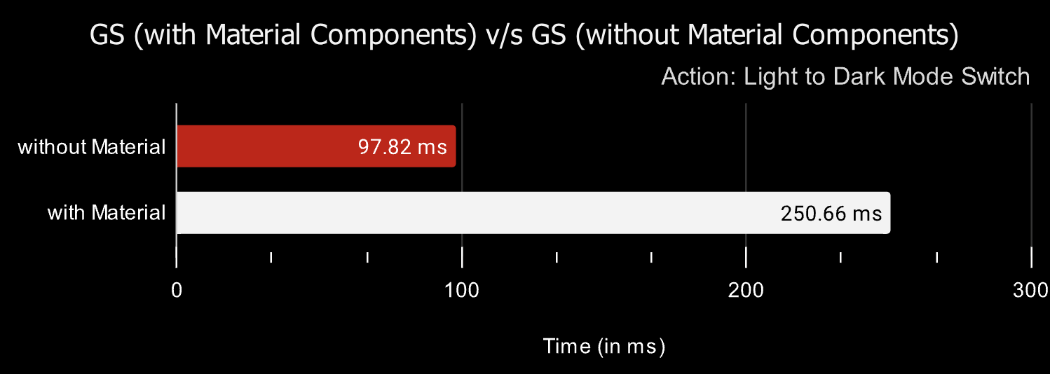
After conducting a comprehensive performance benchmark, comprising an average of 10 samples obtained from our KitchenSink application utilizing both gluestack-ui-flutter with Material and gluestack-ui-flutter with Non-Material widgets, we are pleased to present the ensuing results for your review.
Future Considerations
gluestack-ui-flutter is committed to continuously expanding its library of components to meet the needs of developers. We plan to add more components to the library, such as navigation, combo box, and accordion. Apart from that, we have plans to introduce bundler plugins in the future to ensure even greater levels of performance.
- Enhanced Widget Configuration: The widgets will be designed in a modular fashion, allowing users to plug in different components or features as needed. This modular approach enables more complex and varied widget compositions.With more control over the widget design, developers can create applications that offer a better user experience, tailored to their target audience.
- Configurable Token System: Design the token system to be scalable and customizable. Users should be able to add new tokens or modify existing ones to suit their project needs.
Community
Discord
Get involved with the community, ask questions, and share tips, join our Discord.
To receive updates on new primitives, announcements, blog posts, and tips on using the library.
GitHub
To report bugs, request features, or contribute to the library, check out the gluestack-ui-flutter GitHub repository.
Stay updated about our company and collaborate on enterprise-level projects.
Edit this page on GitHub